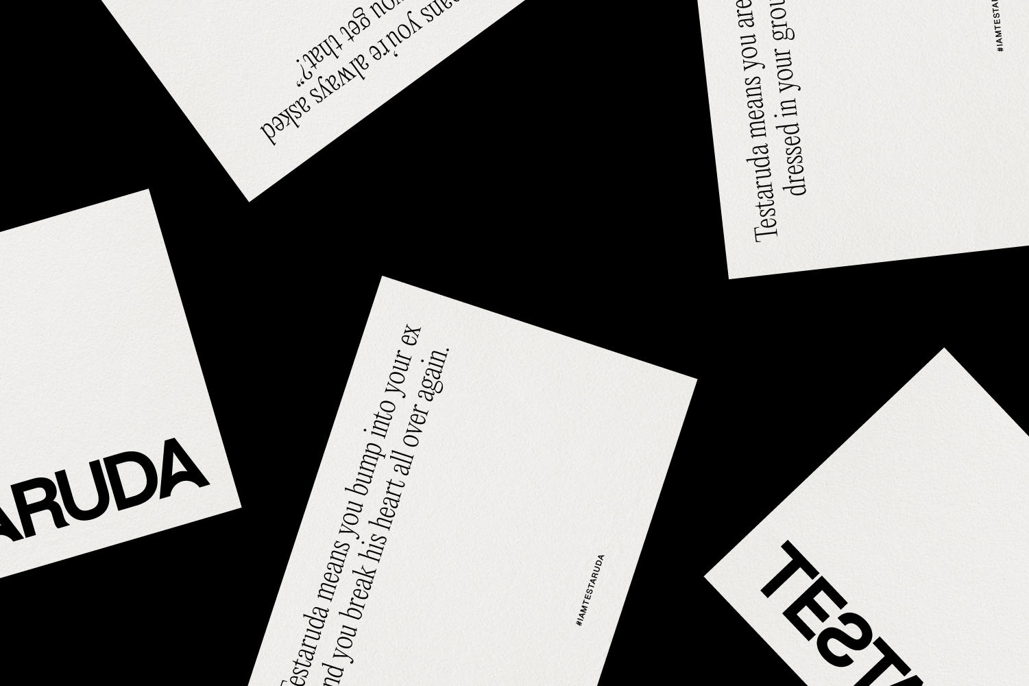
A playful wink with attitude.
CLIENT LOCATION
Testaruda Madrid
SERVICES
Visual Identity
CREATIVE DIRECTION
Berta Bernad
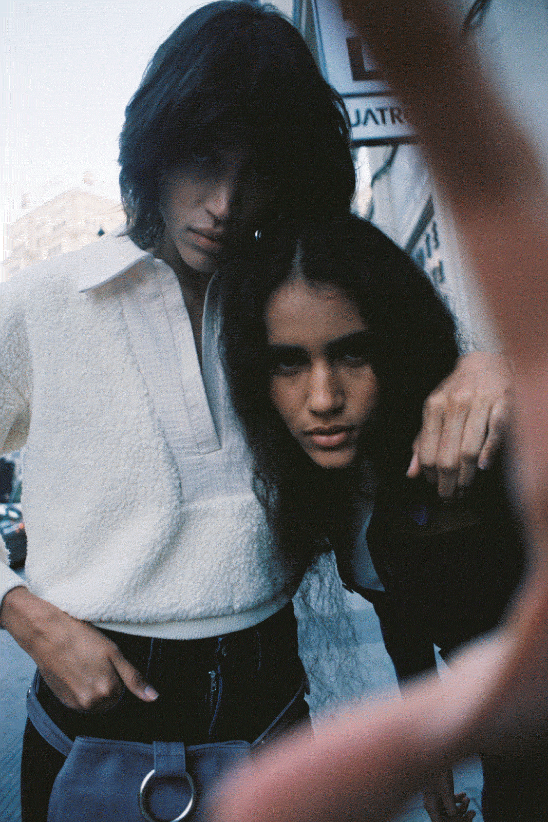
Testaruda is the fashion brand founded by Madrid-based creative director Berta Bernad, a brand inspired by contemporary and timeless garments based in a drop-base business model where sustainability is directly related to the durability and aesthetic of the garments.
Durable, sexy and quality clothing locally produced full of attitude for those who know what they want.
FEATURED IN
Vogue Spain
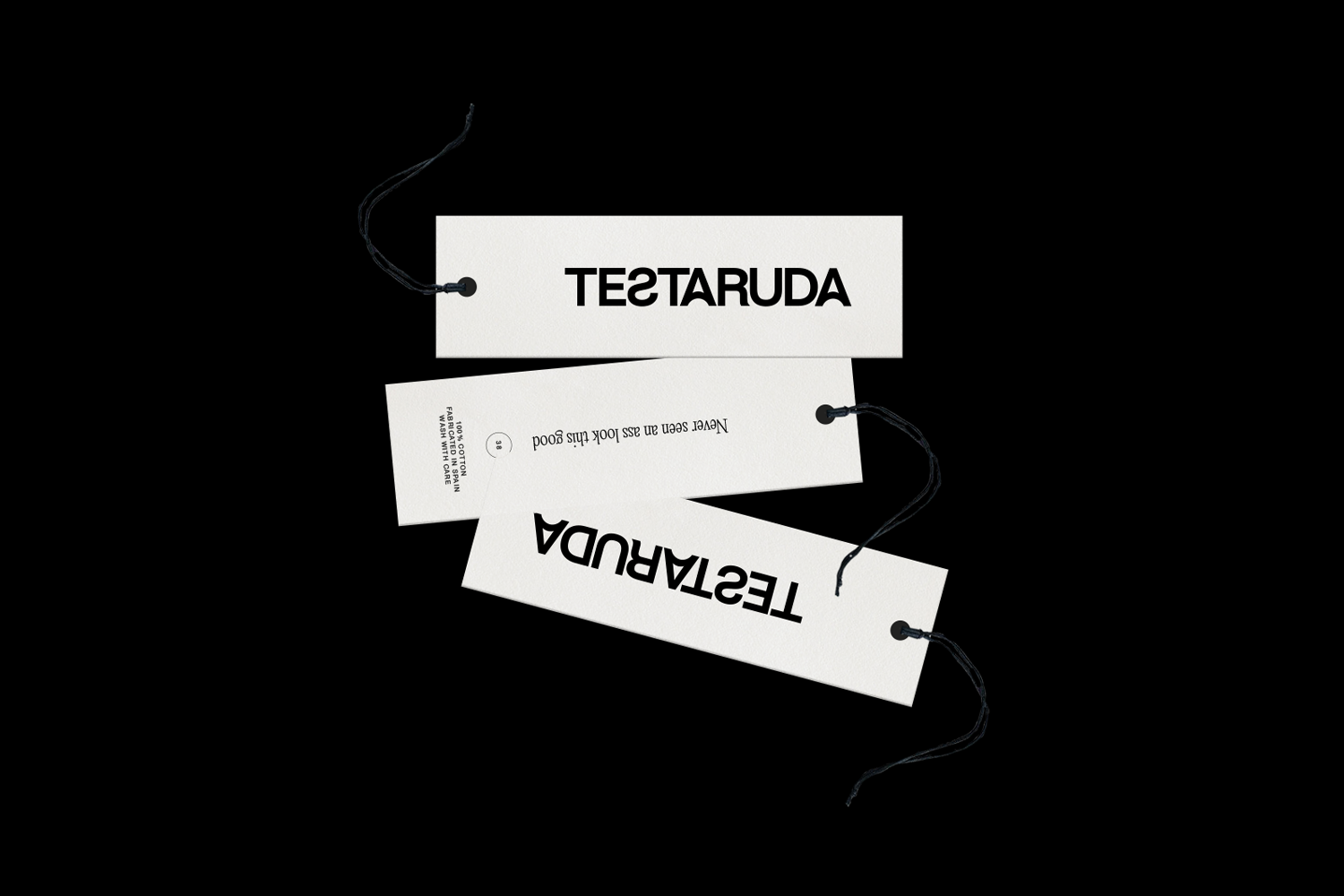
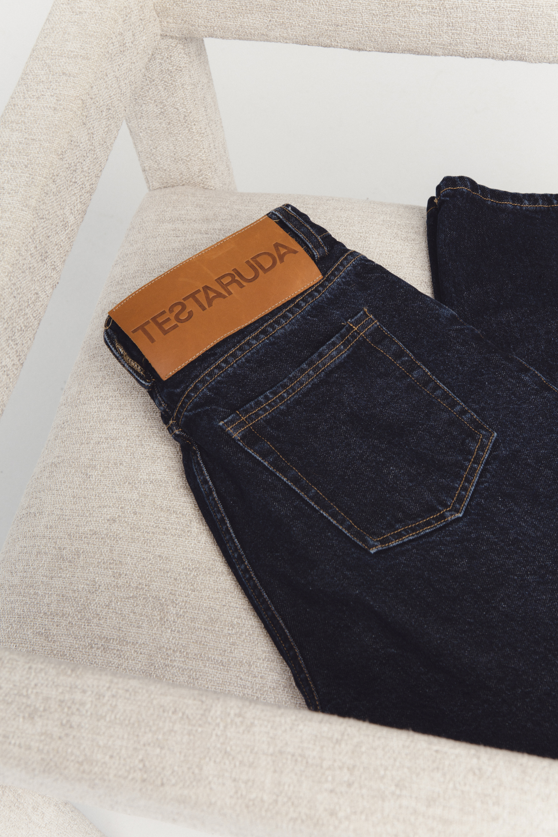
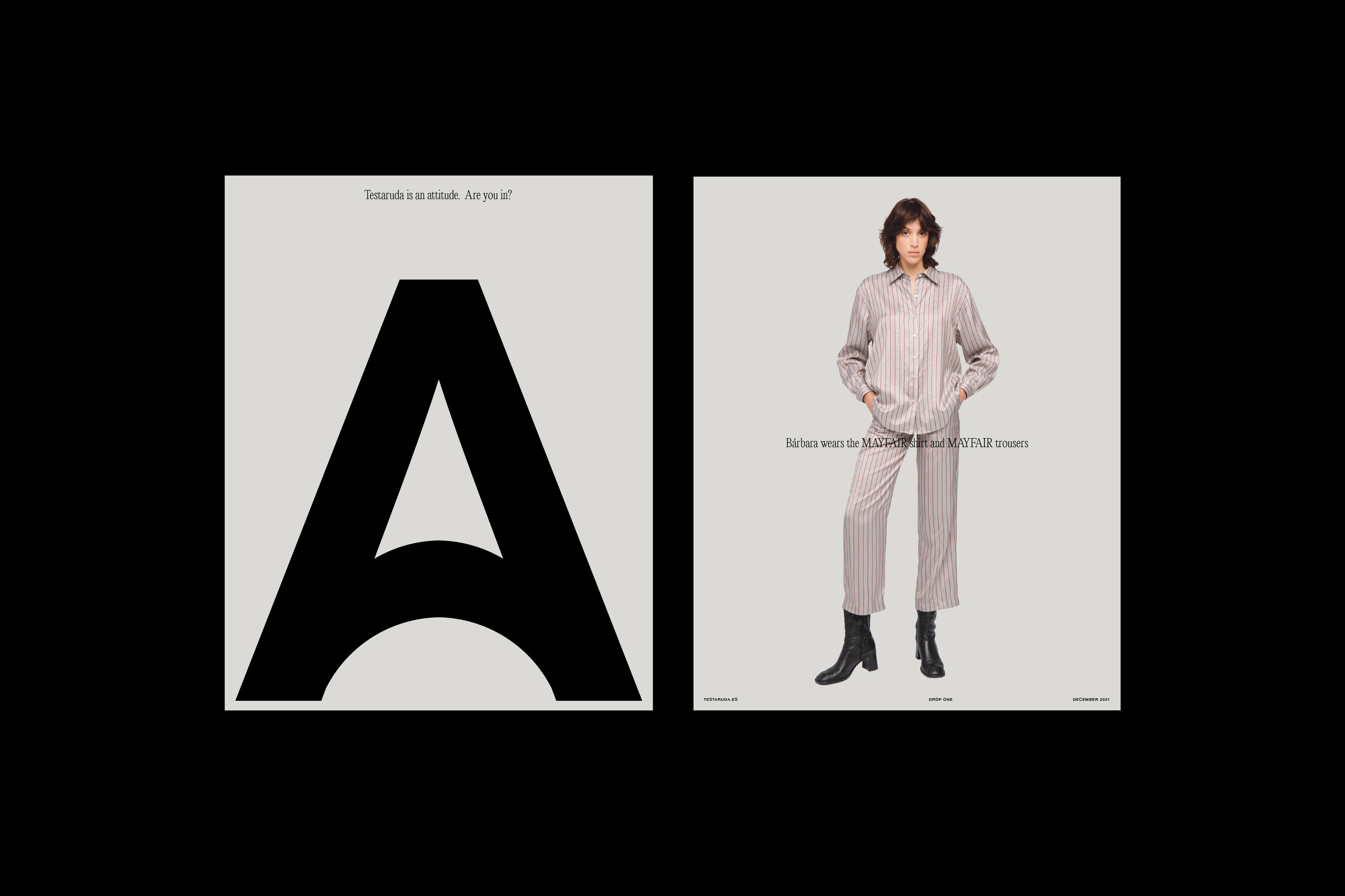
‘Testaruda’ means Stubborn in Spanish, a reference to a person who maintains firm in their ideas or/and attitude. Taking advantage of having a brand name with such a strong symbolic meaning, we found inspiration in face gestures and bold typographies for the logotype. The A was inspired by the mouth gesture in disagreement and the S in backwards makes a reference to a project that doesn’t follow rules or fashion trends, as Testaruda is here to break with the fashion mass-market.
A playful approach where typography presence and visual strength help to define a project with a solid declaration of intentions.
They go right? We go left.